In my last post, Why Your Website is Leaking Money: The Ultimate Guide to Landing Pages, we had a brutal reality check. We diagnosed why your visitors are leaving without buying confusing layouts, weak offers, and zero follow-up strategies.
Diagnosing the leak is step one. Plugging it is step two.
Today, we stop the bleeding. We are moving from “what’s wrong” to “how to build it right.” I’m going to walk you through the exact architecture of a high-converting landing page a page designed with one singular purpose: to turn a stranger into a lead or customer.
No fluff. No “design theory.” Just the step-by-step blueprint to building a money-making machine.
Phase 1: The Foundation (Before You Design Anything)
Most people skip this and go straight to picking colors. That is why they fail.
Step 1: Define One (And Only One) Goal A landing page is not a homepage. It does not need a “About Us” link, a blog feed, or your Instagram photos. It needs one job.
- Are you selling a specific product?
- Are you getting people to book a consultation?
- Are you collecting emails for a free ebook?
The Rule: If the user can do more than one thing on the page, conversion rates will drop. Pick one goal and ruthlessly cut everything else.
Step 2: Know Your “Who” You cannot write copy that converts if you don’t know who is reading it.
- Who are they? (e.g., Small business owners in Lagos).
- What keeps them up at night? (e.g., “I’m spending money on ads but getting no calls.”)
- What is the dream solution? (e.g., A website that sells for me while I sleep.)
Phase 2: The Build (The Anatomy of the Page)
Now, we build the page from top to bottom.
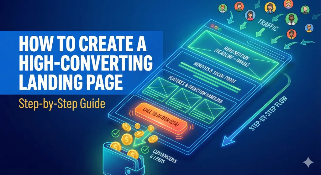
Step 3: The Hero Section (The 3-Second Test) The “Hero” is the top section of the page. It has to answer three questions in under 3 seconds: What is this? Who is it for? What do I get?
- The Headline: Do not be clever; be clear. Focus on the benefit, not the feature.
- Bad: “We offer integrated digital marketing solutions.”
- Good: “Get More Leads in 30 Days or You Don’t Pay.”
- The Sub-headline: Explain how you deliver the promise in the headline.
- The Hero Image: Use a high-quality image of the result (a happy client) or the product in action. Avoid generic stock photos of people shaking hands.
Step 4: The “Agitate-Solve” Copy Don’t just list features. No one cares that your software “runs on Python” or your coaching “includes 4 Zoom calls.” They care about their problems.
- Agitate: Remind them of the pain. “Tired of chasing clients who ghost you?”
- Solve: Present your offer as the only logical solution. “Our automated follow-up system ensures no lead slips through the cracks.”
Step 5: Social Proof (The Trust Factor) Nigerians (and humans in general) are skeptical. We don’t trust what you say about yourself; we trust what others say.
- Testimonials: Real names, real photos. “Great service” is weak. “Jackson helped me double my sales in a week” is strong.
- Logos: “As seen in” or logos of companies you’ve worked with.
- Data: “Over 500 businesses helped.”
Step 6: The Irresistible Offer & Call to Action (CTA) Your CTA button should not say “Submit.” That is boring. It should describe the value.
- Instead of “Submit” → use “Get My Free Audit”
- Instead of “Contact” → use “Book My Strategy Call” Make the button a contrasting color (like bright orange or green) so it pops off the screen.
Phase 3: The Technicals (Don’t Let Tech Kill Your Sales)
You can have the best copy in the world, but if the page breaks, you lose money.
Step 7: Mobile Optimization is Non-Negotiable In Nigeria, 80%+ of your traffic is on a phone. If I have to “pinch and zoom” to read your text, I am leaving.
- Stack your content vertically.
- Make buttons large enough to tap with a thumb.
- Ensure images don’t push your text off the screen.
Step 8: Speed Kills (In a Bad Way) If your page takes 5 seconds to load, you have already lost 40% of your visitors.
- Compress your images (use tools like TinyPNG).
- Remove heavy animations.
- Use good hosting.
Step 9: Remove Navigation Links This is the biggest secret. Remove your header and footer menu. On a landing page, there are only two ways off the page:
- They convert (click the button).
- They close the browser tab. Do not give them a third option to “browse your blog” and get distracted.
Phase 4: Post-Launch (The “Secret Sauce”)
Step 10: A/B Testing Your first version of the page will be good, but it won’t be perfect.
- Test two different headlines.
- Test a red button vs. a green button.
- Test a short form vs. a long form. Let the data tell you what works, not your gut feeling.
A high-converting landing page isn’t magic. It is engineering. It is a psychological path that guides a visitor from “Who are you?” to “Take my money.”
If you followed the advice in my previous post, you know where the leaks are. Now, you have the blueprint to build a watertight vessel.
Need help building this? I don’t just write about this stuff; I build it. If you want a high-converting landing page designed and developed for your business without the headache of doing it yourself:
[Click Here to Request a Landing Page Project]


